Here is my final layout for my interview page, on my featured artist 'RHIRHI'. I have only amended this slightly, by adding white boxes to my interview to make it more readable and also with my work experience with LIVE MAGAZINE'S design team, i noticed that the majority of their interview pages or any page in general tended to have a white background.
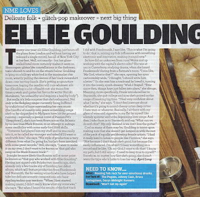
I also searched some interview pages online, just to back up my point of what i think is a typical convention:

As you can see, all of these examples have a background of some kind (mainly white).
Overall i feel that i am happy with my final product and i think it has improved slightly from my draft layout. As i have used limited colours (from my colour palette), i do not feel that it looks too busy and is too the point. Also not having many colours can help the reader draw their attention to my main image, which i feel represents 'RHIRHI's personality very well (due to facial expression and posture etc.) and i feel the mise en scene used i hope can differentiate my music genre from others (i used a guitar, style of clothing etc.)
I also used my masthead at the top left of my page to identify the interview as part of my magazine and i have used the same font text as i have throughout the whole of my magazine.


I manipulated my images on photoshop adjusting the brightness and contrast, cutting them out with the pen tool and colouring in the t-shirt with the colour replacement tool. I feel that making the t-shirt stand out brings out an edge to the page as it may have looked really plain without it.
I have also used pull quotes to (as well as being conventional) interest the reader into reading the whole interview as i have chosen one which is quite comical "pepparami's...". I hope this would attract my younger audience and maybe they can relate to these quotes in some way about teenage life etc.
In conclusion i feel that this was quite a success and i enjoyed creating the whole piece and i feel it was a really good experience to help me realise that its not very simple to create a double page let alone a whole magazine, and how much thought has to go into a magazine altogether to attract your target audience.


0 comments:
Post a Comment