As RhiRhi enters our studio, she looks calm and cool in tight jeans, and a chequered top. For her first photo shoot she seems to be quite a natural at taking great shots, She jokes around with our make-up artist and seems right at home. For someone with such a mighty voice, she’s pretty titchy regardless of her heels! We can’t wait to see what she has to say to us about her up coming album ‘Reincarnation’, pepperaimi’s and PAT the dog:
Hey it’s a real pleasure to have you here, how are you coping with your new found fame?
Cool thanks! I’ve been pretty busy producing my first album, it’s a lot of hard work and keeping up with my new popularity has been one I’ve had a hard time getting used to, but i'm loving it!
Yeah, we heard about your up and coming album release, are their any nerves kicking in as it’s your first time?
You know I just go with the flow, there are a few nerves but once i’m in the studio you forget about all that, you see its all just to do with the music and if i’m happy with it, nothing else will put me down, if people love my music that amazing but if they don’t, there’s no biggie.
Ok, we can’t keep this in any longer; we’ve sneakily had a pre-release listen to your album at HQ, and were really impressed. Was this all your own work is there someone behind the scenes helping you out, and are you inspired by any current artists?
(laughs) you sneaky little...(laughs) wow thanks guys, erm yeah well you know most of its all from the heart, past experiences you know and all that jazz, they’re key to my music and emotion is what I try to pass on to my fans, so they feel connected to me, you get me? You know behind all the bass and guitar and what people have referred to me as ‘drunken music’, there is actually meanings behind all of my songs. But i’m not gonna lie, I’ve got my inspirations.
Who?
You no, my mum, dad, friends, I’ve lived through life seeing so many things happening, good and bad. I try not to follow other celebrities, I like to be individual.
Yeah, that’s all good we like that. So what are your plans for the next couple of months? Are you considering going on tour after your album release?
I got a couple of photo shoots and interviews coming up, finalising the album, just preparing for my release really and well see what goes on from there, if people like my album then yeah, touring sounds great, I’d love to get in touch with my fans.
Ok, just some random questions now, c’mon its standard procedure, what did you last text say and who was it from?
(laughs) from my brother saying he wants his clothes back.
Ha-ha, yeah we can understand that, what’s always in your fridge?
Pepperamis and Dr.Pepper, I cannot survive without them their my daily fixes, c’mon I’m a teenager? Healthy food doesn’t exist in my world.
Yeah tell me about it, do you have any pets?
I have a fish named COD and a dog named PAT.
HAHA I get it, that’s pretty awesome, well its been great talking to you Rhi, good luck with your new album!
(laughs) yeah thanks guys! Bye!
Note: this is my first draft of my interview, so on my actual final double page you may notice some differences.
Friday, 26 March 2010
Copy of my interview material
Thursday, 25 March 2010
Interview Page

 << As you can see NME have used a black and white/sepia effect photograph as their main feature on the page, embedded in the interview. They have also added a pull quote. Something else that i have realised is that they have added random information at the bottom of the page within the "did you know?" header, this may also be another idea that i might experiment with when i produce my final product.
Colour Palette

Thursday, 25 February 2010
Ofiicial images for my interview of rhirhi; double page spread:
When taking these photographs, i asked my model to pose in different postitions to represent herself as a new indie artist. The mise-en-scene i used to portray this is mainly her costume which included skinny jeans, heels, brightly coloured tops, lots of jewellery and sunglasses/nerd glasses. The props i used were an electric guitar, microphone and a stool. This is my favourite out of the whole photoshoot, it will potentially be on my front cover, but i shall experiment with alot of designs and photographs. I added a spotlight to the photo to make it look as if she is on stage in the spotlight. The high angle is a very good technique and as she is looking up it creates a really good effect. Her mise-en-scene suits the music genre of indie rock. Also the wooden flooring adds a good effect.
 I really like this photograph, its a very natural pose and the angle of the picture adds a good effect. Her facial expression is very natural and it almost looks as if she is about fall which adds quite a good effect. I added a black and white effect and adjusted the brightness and contrast.
 This photograh is very funny. She has posed in a very humorous pose which is ideal for a good caption. I adjusted the brightness and contrast of this and then added a film grain effect. It yet again shows the reader what kind of personality rhirhi has.
 This photo also has alot of character due to her body language and her facial expression. I can show the reader what type of personality rhiannon has. I added a sepia effect and a film grain add character to the picture.
 This photograph has alot of personality in it. It almost looks as if she is behind stage at a gig and pulling a funny face. I shall put a humorous caption on this photograph. I added a sepia effect and a film grain.
 The mise-en-scene in this photograph plays an important part in the atmosphere and character of the picture and the artist. As she is leaning on the guitar it shows a strong relationship between the artist and the instrument. The glasses add character and the wooden flooring adds a more homley feel rather than a normal stage (it can seem as if she is doing a more intimate gig than a whole concert.) The black and white effect also adds alot of personality to the photo. There is also a slight angle to this photgraph aswell which emphasises the shape of the guitar and the length of her legs.
 I feel that this photo has alot of character and personality due to the facial expresison on the model and the sunglasses; it can help the reader relate to the artist in a more personal way and see whats behind the music. I added a black and white effect and film grain.


I added a sepia effect to this photograph, along with a film grain to add texture and personality to the picture. Her facial expression shows that she is immersed in her music and her guitar is a very precious object to her. Her posture is very strong which can show her confidence as an artist.
Wednesday, 24 February 2010
Indie Mise-en-scene-male
Here are some images i found on google of indie boys (these may attract my female readers) and their style and mise-en-scene (e.g. posture, facial expressions etc.)


Indie Mise-en-scene -females


Monday, 22 February 2010
Preparation/dress rehearsal for my 'Interview' photoshoot

 These photographs are very similar to those that i will take for my final interview double page, it has shown me what i want to improve and differ for my magazine. I was limited to props,
Experimenting with music genres:
 This is a very iconic photograph of Bob Marley, a very famous Reggae artist.


Me and a partner were given the task to take one photograph based on the music genre of 'Reggae', we looked at a photograph of 'Bob Marley' and he is an iconic Reggae artist and we tried to duplicate his style and mood in this photograph. The photos i have uploaded represent the stages of photo manipulation taken out to create our final photograph. We focused on the facial expression of my parnter which is very laid back as it represents a very laid back style, portraying the mood of the music, the body posture of the artist looks as if she is dancing.

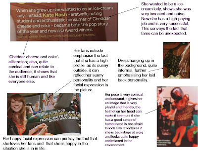
 Me and a partner were given the task to analyse and annotate pieces of the magazine 'Q'- ours was on an interview of Kate Nash.
Sunday, 21 February 2010
Moodboard:

Tuesday, 2 February 2010
Reader profile for 'Q' music magazine

When me and a partner analysed 'Q' magazine we realsied how much the music genre of this magazine was portrayed through images and text, not things that you would notice at first glance, but when actually taking time to look closely at each page and text, we noticed how much the genre plays a key part in the whole content of a magazine.
How to run a successful music magazine (research taken from NME case study)
 This has really helped me to evaluate what makes a good music magazine and how to reach my target audience. I feel that this will help me when producing my own magazine.
Magazine cover connotations and denotations; comparisons of magazine covers-powerpoint presentation.


