BLOGGER TEMPLATES - TWITTER BACKGROUNDS »

Welcome

This blog will outline the steps that i have taken to produce my own indie music magazine

Which music genre do you prefer or best suits you?

Do you pay attention to the slogan of a magazine?

Thursday, 29 April 2010

Evaluation Presentation


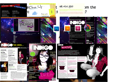
Here is my evaluative presentation, outlining the decisions i made when producing my magazine. Looking at each slide, it may not make sense as it looks as if my images are just piled on top of each other but i had added a lot of animation to my slide show, as to limit the amount of slides i used.
Overall i feel my presentation went O.K but i think that i could have done better and maybe prepared myself to a fuller extent as i feel that i had missed out a lot of information under the pressure of being examined.


Thursday, 22 April 2010

Recap on my target audience and reader profile


I feel that i need to remind myself of my target audience in preparation for evaluating:

Age: 13-19 years
Gender: initially aimed at females, but males are targeted to a smaller extent
Occupation: students (some who work part-time)
Demographic/social class: C1
Main music genre: Indie Rock

The typical reader of INDIGO magazine will be interested in music to a great extent and will possibly play an instrument (i.e. guitar). They will be part of a social networking website or forum and will attend gigs or/and concerts regularly.

Most of this information is supported by my questionnaire.

My magazine will reflect my reader profile and will try to cater to the needs of the readers or target audience e.g. as many people are in full time education the magazine will not be very high priced, and they like to attend gigs so my magazine will entail a competition to win VIP tickets to the Brit awards (Which i feel is a very popular venue for indie artists) - my reader profile will have mostly entailed all the decisions for the production of INDIGO.

Final contents page layout

Here is my final layout for my contents and as you can see, it is completely changed from my draft attempt. I have changed my background from black to white (as i had researched a few magazines and found that they where white and i wanted to be conventional) I have maintained my images though, but i have changed the heading of the page. Instead of using the 'CO-NT-ENTS' layout i used in my previous design, i have decided to use my masthead (with added lens flare similar to my front cover, to show a relation to my front page and keep my magazineflowing.


(here you can see a white background-Q mag)


I have also added subheadings (which is also present in current music magazines which helped assist this decision) to help make finding regular items etc. easily accessible to my readers.
I have also kept my editors letter as i feel this is a vital part of my contents page and making the magazine look a bit more laid back.
I feel that there is such a large improvement compared to my draft and my preliminary task as it looks so much more busy and readable. I hope this will attract my target audience and help my magazines content to be easy to find and skip through etc.


These are the pictures that i used in my final contents page, as you can see i have edited my image for my main artist as i feel that it was way too large to put on my final page and it looked a bit dull, so i adjusted the brightness and contrast and added a film grain effect. With my image of the guitar i slightly adjusted the contrast. I feel that adding the image of a guitar can make it slightly more obvious that INDIGO is a music magazine as without it, just having pictures of RHIRHI can make it seem more fashion based etc.
The overall content of my magazine includes competitions, interviews and posters etc. to keep my target audience interested and more likely to purchase my magazine again.
Overall i think that this was very successful.

Monday, 19 April 2010

Final front cover layout


Here is my final layout for my front cover. In my point of view, i feel this was the most successful out of my three final pieces. I feel that compared to my first draft, there has been alot of development. I feel that the page looks alot more busy and professional. I have followed quite a few conventions here, for example, the masthead is white (and as i have observed before that alot of mastheads are white), i have included a barcode and price (Which is considerably lower than other leading music magazines e.g. NME), a main image of my featured artist, lists of features in my magazine, a banner at the top of the page and a little 'sticker'.

I am really happy with my final outcome and i can really recognise how much my skills have developed compared to my preliminary task and i can recognise that my knowledge of conventions has developed aswell. I feel that the colour scheme that i had chosen really went well and i think that it would look attractive to my target audience.


I also think the language i used can attract my target audience as i have used puns etc. e.g. "GOOD IDEA OR A PLAN FOR A MONSTER DISASTER?", lady gaga's new album is called MONSTER BALL so i have incorporated the name of her album into my headline, which is quite comical.


As you can see this is my main image from my front page, the original shot and the edited version. I feel that the mise-en-scene from this photograph can represent the social group reading my magazine, through facial expression, a high angled shot, and lighting etc. I have added a spotlight to this image, removed the date with the clone stamp and adjusted the brightness and contrast.

Overall i feel that this was a successful layout for my magazine, and when looking at my interview page and contents page, you can see the assocciation between each page and you can tell that it is from the same magazine etc.

Sunday, 18 April 2010

Final interview page layout


Here is my final layout for my interview page, on my featured artist 'RHIRHI'. I have only amended this slightly, by adding white boxes to my interview to make it more readable and also with my work experience with LIVE MAGAZINE'S design team, i noticed that the majority of their interview pages or any page in general tended to have a white background.

I also searched some interview pages online, just to back up my point of what i think is a typical convention:


As you can see, all of these examples have a background of some kind (mainly white).


Overall i feel that i am happy with my final product and i think it has improved slightly from my draft layout. As i have used limited colours (from my colour palette), i do not feel that it looks too busy and is too the point. Also not having many colours can help the reader draw their attention to my main image, which i feel represents 'RHIRHI's personality very well (due to facial expression and posture etc.) and i feel the mise en scene used i hope can differentiate my music genre from others (i used a guitar, style of clothing etc.)


I also used my masthead at the top left of my page to identify the interview as part of my magazine and i have used the same font text as i have throughout the whole of my magazine.


I manipulated my images on photoshop adjusting the brightness and contrast, cutting them out with the pen tool and colouring in the t-shirt with the colour replacement tool. I feel that making the t-shirt stand out brings out an edge to the page as it may have looked really plain without it.


I have also used pull quotes to (as well as being conventional) interest the reader into reading the whole interview as i have chosen one which is quite comical "pepparami's...". I hope this would attract my younger audience and maybe they can relate to these quotes in some way about teenage life etc.

In conclusion i feel that this was quite a success and i enjoyed creating the whole piece and i feel it was a really good experience to help me realise that its not very simple to create a double page let alone a whole magazine, and how much thought has to go into a magazine altogether to attract your target audience.

Preliminary task-how my skills have developed


Here was my preliminary task that i did at the beginning of my AS year. I was set the task to create a front cover, contents and interview page for year 11's moving on to sixth form. Mine was about media and photo-manipulation. I think that my skills have improved in regards to my knowledge of conventions and layout. Looking at my prelim. , it looks as if all my pages are from different magazines and there is no ovbious genre for my magazine as a whole. On the other hand my INDIGO pages all have a link, wether it be colour scheme, masthead or overall language.
Looking back at my preliminary task has really made me realise how much my skills have developed and how my knowledge of how to create a successful magazine has developed.
I also feel that my skills on photoshop have developed slightly and of course my skills on blogger have improved alot as i had never used it before this assignment.
Im also really glad that we got the opportunity to do a preliminary task as it does really help you notice how far you come along in the course and it gives you a little experience before the real thing and you can go back to your prelim. for help and reminders of what to do on photoshop etc.

Friday, 16 April 2010

First draft of Contents Page

This is my first draft for my content's page. As you can see i have included my editors letter and the images i mentioned before. I feel that even though it was a good attempt and i think that i have grasped the overall layout of a contents page, i feel that it could be so much better and i feel that i have not followed conventions to an appropriate extent, even though this can possibly be a good thing, but i would rather follow them than go against them. For example i feel that i would prefer a white background (as a lot of magazines do, and i think it also looks more professional)- in contrast to my black background, but i wanted to experiment with colours etc.

I also think that the top right hand corner seems very empty and i think i could fill this with more content for my magazine (E.g.more page numbers and stories). I also think that i would change the way 'CONTENTS' is written, even though i do like the fact that it is broken up, but maybe my target audience will find it hard to understand or find it unnecessary.
On the other hand i do like my use of images and the overall style of the contents can be related to the rest of my magazine e.g. front cover and interview. and i think it looks like a music magazine.


I shall make ammendments to this, along with my front cover and interview page.

Images for my contents page


Here are the two images that i will be using in my contents page, i did not really want more than two because, on a single page, things can seem a bit cramped and cluttered. I feel that the first picture can idicate that my magazine is a music magazine and the genre can be hinted at the fact that is is a guitar and they are common in indie music (or any type of music in general). The second image is of my main artist RHIRHI i feel that it is quite a comical image and can show her true personalily behind all the fame etc. it may also encourage the reader to turn to her story as it looks interesting.
(click images for full view)

First draft of my EDITORS LETTER


Here is my first draft of my editors letter, as you can see i have followed conventions by adding a signature at the bottom to personalise it a little (especially as it is in pink) I've used quite informal language to relate to my target audience who are considerable youthful, so i have also tried to incorporate their style of language into is aswell e.g. "Hey guys!". I've also tried to add a sense of humour so this should also attract to many youth's as it can make the magazine a bit more enjoyable to read.

Editor's letter's

I personally feel that i will include an EDITOR'S LETTER into my contents page as i feel that it is a good way as a magazine as a whole to personally communicate with readers on a deeper level.
I have searched some images for editors letters and one from my own music magazine i had purchased, and two from a magazine of a different genre so i can recognise the differences and similarities of conventions and techniques:


Here are two editors letters from two different magazines (fashion magazines) and straight away you can recognise some main conventions: A image of a story or the editor themselves, a signature or the name of the editor and i can see that the first letter of the paragraph is enlarged.


This is an editors letter from 'Q' magazine May 2010, so this is quite recent. In comparison to the other two letters, there are a few similarities e.g. an image of the editor and a signature, and the overall layout is quite similar. They are short and snappy and do not usually exceed one corner of a page. I feel that magazines chose to write editor's letter's as to communicate with their readers on a more deeper, personal level.

The language used is quite informal and its very to-the-point and snappy. It also sets a tone for the rest of the magazine in terms of how they write etc.

Use of nicknames e.g. "La Welch" sets a tone for the whole magazine to be quite laid back and informal which probably is more approachable for their target audience rather than a magazine full of long, complicated words etc. They also use expletives "bitch" which is also another informal, you could say modern, approach to a language technique.

The overall purpose for a editor's letter is to summarise the whole content of the magazine in one paragraph, or to mention important stories etc. The language is quite laid back-as though they are talking to the reader face-to-face. I feel that i will produce my own editors letter, and mention special competitions etc. Just to be conventional and to communicate with my readers on a more personal level.

Thursday, 15 April 2010

Analysing contents pages


Here are two analysed sets of contents pages from Q magazine (click on images to enlarge and view in detail) I have recognised that on two different issues, they have used the same layout, colour scheme and font etc. in each contents page. Its very obvious what conventions are used in these two images as they are consistent throughout each issue, and i am sure that if i was to search more Q magazine contents pages, they will be present aswell.
Analysing these examples of contents pages has helped me recognise the typical music magazine layout of a contents page. I have also recognised important conventions, so i can use them in my own magazine.
I will further investigate language used in music magazines and what technique will suit my own target audience.


Wednesday, 14 April 2010

Planning my contents page

For my contents page, i know for sure that i am going to be met with many problems, edits and adjustments as i think it will be difficult to fit a whole magazine's contents on one A4 page. I am going to do some research on current contents pages to get inspiration for my own layout/colour/ language style etc.

Work Experience at LIVE/LIVITY MAGAZINE

I was privileged enough to get the opportunity to work at LIVE MAGAZINE for two days; who are a free magazine aimed at the youths of Lambeth. I feel that this was the perfect opportunity to get ideas on how a real magazine industry worked and it has given me loads of ideas to perfect my own magazine, and of course it has helped me to see what working in a magazine headquarters is like. I worked with the design team (who create the layout and illustrations on each magazine page) and i think it was an amazing experience and it helped me to develop my skills on editing programs i had never used before (e.g. adobe illustrator).


I have also managed to get my own illustration into their next issue (based on the future) which is great (displayed above)


Overall i feel this was a really good experience as it has deepened my knowledge on magazine conventions by recognising LIVE'S own compared to magazines i have previously researched: e.g. they have a white mastead and they use the same font throughout the magazine etc. >>>

Tuesday, 13 April 2010

Example of two music genres collaborating with eachother

Recently i have realised that the collaboration between INDIE MUSIC and DUB STEP has increased especially amongst the ages of 13-25 year olds and most fans of both music genres. I have noticed this because myself and many of my friends enjoy this type of music and on websites such as YouTube, these songs have become above 4 star rated and have many positive reviews. I think that this may be something that i may mention in my CONTENTS PAGE and FINAL FRONT COVER as this may draw to my target audience.

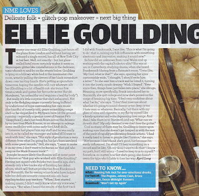
Here are two examples using ELLIE GOULDING and JAKWOB:


New convention?


When browsing through magazines in WhSmith, this version of 'Q' magazine really caught my eye and i felt it deserved to be posted on here. There seems to be 2 front covers. One was a almost 'CD style' cover for the actual magazine with the other front cover. I feel that they had chosen to do this because there was possible two main stories that they wanted the reader to see and they maybe felt that they both deserved the front page. I have hardly seen this technique used in music magazines, and i initially thought that it was done because 'FREE MUSIC' was advertised and i assumed that there was a CD inside and the cover was for security; but i later found that the free music was a download inside the magazine so this was a false accusation. I feel that this may catch on to other music magazines and may be a common magazine convention in the future. (You can see that on the right is the actual magazine and the left is the cover)

Monday, 12 April 2010

Kings of Leon live performance

This is a video of Kings of Leon performing live at the Brit awards, I think this can relate to my target audience and my magazine as they are a very popular indie band and they can seem attractive to my target audience etc. Also, i am thinking of including the Brit Awards in a competition in my magazine e.g. to win tickets as i feel this shall draw people to my magazine and it includes a lot of indie acts. I also chose to publish a live performance as i feel that it shows the artist's pure potential and talent without any technological editing.

First draft of my front cover


As a first draft, i feel that this went pretty well, but i can allready see loads of room for improvement. For example; i feel that there is a lot of empty space, so i should fill this with more headlines and content of my magazine etc. I also feel that the masthead should stand out a bit more. I am happy with the overall design and feeling of the magazine and i feel that it represents my music genre as the colour scheme is quite bright and the lighting effects that i have used against my main artist can represent stage lights etc. I feel that i have used current magazine conventions with a white masthead, barcode and price, and a main image of my featured artist. I shall further evaluate in deeper detail when i have produced my final image and i have edited anything that i feel needs improving.

Friday, 9 April 2010

Charts of my findings

Here are some pie charts that i have drawn up from some of my findings from my questionnaire that i feel can be considerably important in the making of my magzine even though all of my findings contribute to production.

This pie chart represents the population of my target audience who download and buy singles regularly (from my sample of 10 people from my target audience). It shows that the majority (80%) do download music regularly, so this can encourage me to include download offers in my magazine e.g. iTunes vouchers or a download chart etc. to cater to their purchasing needs. These can also stimulate the other 20% to do so also.

This chart also shows me that the majority of my target audience have an iTunes account which usually indicates that they are in possession of an iPod or a Mp3 player of some kind. So for the remaining 20% i can introduce this form of media tecnology through a competition to win an iPod etc. To also promote the current 80%, i could, as i said before give away vouchers for iTunes etc.


Thursday, 8 April 2010

Questionnaire-research into reader profile etc.


I carried out a questionnaire on my target audience to see what type of content they would like to see featured in my magazine. These are the results that i have gathered from asking 10 people.


Click image for larger picture.